The real problem
Responsive bugs are often review bugs before they are code bugs.
Most blocks are reviewed in one comfortable viewport. The designer checks the desktop state. The builder checks the page where the block first appears. Then the real site is opened on a phone, a tablet, a small laptop, or a rotated screen and the block has to answer questions nobody asked during the review.
The failure is rarely one dramatic bug. It is the accumulation of small misses: a button label wraps awkwardly, a panel needs horizontal scroll, a decorative image has no fallback, a control has no accessible name, or a color pair is readable in the designer eye but weak under contrast rules.
Responsive Render Lab makes those checks part of the normal build loop. The block is not treated as finished until it survives more than one viewport.
Start with the artifact
The best way to understand it is to paste a flawed block and watch what it catches.
The default specimen is intentionally imperfect. It includes enough real-world friction to exercise the warning model: orientation overflow, missing alternative text, missing accessible names, low contrast, and small tap targets.
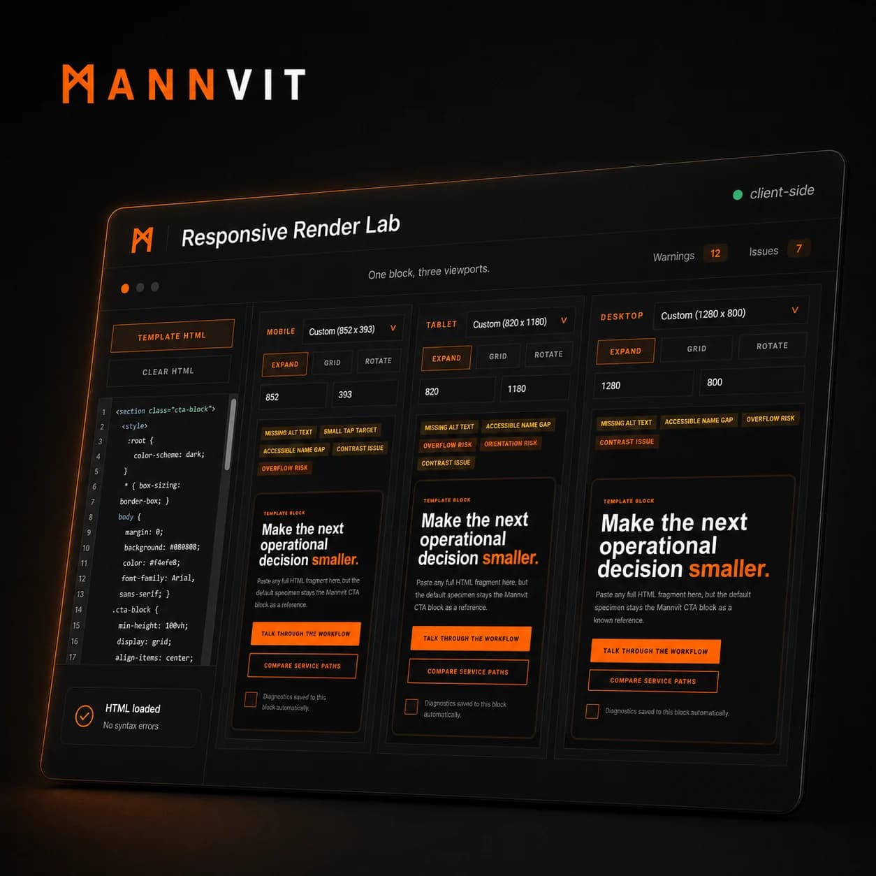
How a block gets approved
The lab is built around the way a block actually gets approved.
The tool is not trying to become a full browser testing suite. It focuses on the handoff point where a block is visually close, but still needs proof that it will not embarrass itself outside the designer viewport.
Compare
Mobile, tablet, and desktop stay visible together
The main view keeps three rendered frames side by side. This makes rhythm problems obvious: a layout that feels balanced on desktop may look cramped on tablet or lose its hierarchy on mobile.
Preset dropdowns keep common device sizes close, while custom dimensions make it possible to test the awkward sizes that teams actually discover in support screenshots.
Expand
Close inspection happens without losing the frame
Each viewport can expand into a larger inspection surface. The reviewer can zoom with the wheel, drag the preview, reset the view, and toggle gridlines when spacing or clipping needs a closer look.
Esc closes the expanded view because inspection should feel fast. The lab is meant for repeated passes, not one heavy modal that interrupts the build.
Diagnose
Warnings are useful only when they suggest where to look
A badge that says "overflow" is a start, but it is not enough. The lab assigns IDs to rendered elements and lets warnings highlight the likely cause inside the iframe.
That makes the warning actionable. The next move is not guessing which rule caused the problem; it is opening the likely element and deciding whether the warning is real or acceptable.
What it checks
The first warning set covers the problems that usually hide in plain sight.
The checks are intentionally practical. They do not try to certify the whole page. They ask whether this block has the obvious risks that would slow down a review or weaken technical quality.
Layout pressure
The lab looks for vertical and horizontal overflow, clipped content, fixed-width risks, and orientation-specific problems. Mobile can be fine in portrait and broken in landscape, so orientation warnings stay visible even when the current preview looks acceptable.
Accessibility fundamentals
It flags missing image alt text, controls without accessible names, small tap targets, multiple H1s, empty controls, and placeholder links. These are not advanced audits. They are the first-pass checks that should not wait for the end of the project.
Visual readability
The contrast check catches text pairs that are likely too weak. It is deliberately used as an early signal rather than a final legal verdict, because design context still matters and computed contrast can miss layered visual complexity.
Image and SEO hygiene
The lab warns about missing image dimensions and missing alt text because responsive performance and search quality often degrade through small repeated oversights. A polished block should not rely on layout shifts or silent broken media.
The design rule
Do not make the reviewer hunt. Put the viewport, the warning, and the likely source in one place.
That rule shaped the interface more than the warning list did. A testing surface can easily become a wall of technical messages. The lab keeps the warnings small, visible, and attached to the preview so the reviewer can stay in visual judgment mode.
Production version
The Builds artifact proves the loop. A production version would make the loop harder to ignore.
Persist test cases per block
The next version would save named specimens, preferred viewport sets, and accepted warnings. That would turn the lab from a live reviewer into a lightweight regression tool for reusable block libraries.
Compare before and after states
When a block is revised, the lab should show what changed: whether overflow disappeared, whether contrast improved, and whether a new warning appeared in a viewport that used to pass.
Export a review artifact
Copying a text report is useful. A production version would also export a small visual report with viewport screenshots, warning summaries, and the exact dimensions tested.
Accept real-world false positives
The goal is not to make every warning fatal. The goal is to force a decision. Some low-contrast decorative text may be acceptable. A hidden overflow container may be intentional. The important thing is that those choices are seen.
If your blocks look finished but keep failing in real screens, test the review loop first.
Responsive Render Lab is the artifact version of that loop: one block, several viewports, clear warnings, and enough inspection tooling to decide what needs to change.
Bring the page, report, or workflow as it is now.
We reply with the clearest next step, or an honest no.